


How to optimize your video packaging (video audit)
Re-packaging a video.

Found Brett Brohl’s video today - did a quick audit.
When it comes to video performance, packaging is important, but it’s not the only factor. There are other variables, like the size of the niche or your Total Addressable Market (TAM), that affect how well a video does. We can't change those elements once the video is uploaded, so let's focus on what we can control - packaging.

Let’s start with the title.
Here’s a breakdown of a common title issue:
No Pain Point Connection:
"Master The Art of Handling Tough Investor Questions"
This assumes founders already care about "mastering" something when, in reality, they’re terrified of rejection
Better: "Why Investors Secretly Laugh At Your Pitch (And How To Stop It)"
Missing Viral Triggers:
No controversy, shock value, or curiosity gaps.
Better: "The ONE Question That EXPOSED My Startup (94% of Founders Fail Here)"
Zero Urgency:
Nothing suggests time pressure or immediate relevance.
Better: "The Investor Objection That Can Kill Your Fundraising TODAY"
No Numbers or Specific Promises:
Brain craves quantification and concrete outcomes.
Better: "3 Deadly Investor Objections I Turned Into a $2.5M Term Sheet"
Weak Call-To-Action:
Doesn't push viewers to take immediate action.
Better: "Steal This Investor Objection Framework (Before Your Competition Does)"
Emotionally Neutral:
Doesn’t trigger high-arousal emotions that drive engagement.
Better: "Stop Freezing When Investors Challenge You (My Bulletproof System)"
Generic Promise:
“Handling questions” feels vague and unexciting.
Better: "The Exact Words That Flipped 7 'No's' Into a 'Yes' From Sequoia"
(don’t actually use these “better” titles they’re ass just there to give you context)
Human psychology demands specificity, stakes, and emotional triggers. Your title needs to create an information gap that your audience is desperate to fill.
Now, let’s take a look at the thumbnail.
Visual Problems:
Text Overload: Too much text competing for attention - this can overwhelm the brain, causing disengagement.
Missing Pattern Interruption: No visually surprising or unexpected elements to catch attention.
Generic Branding: Black and yellow doesn’t stand out in a feed full of high-contrast thumbnails.
Psychological Failures:
No Clear Pain Point: The thumbnail doesn’t represent the frustration or fear of investor rejection.
Weak Promise: “3 EASY WAYS” feels generic and doesn’t pack enough punch.
No Curiosity Gap: Viewers aren’t left wondering, “What am I missing here?”
Here’s my fixed version:
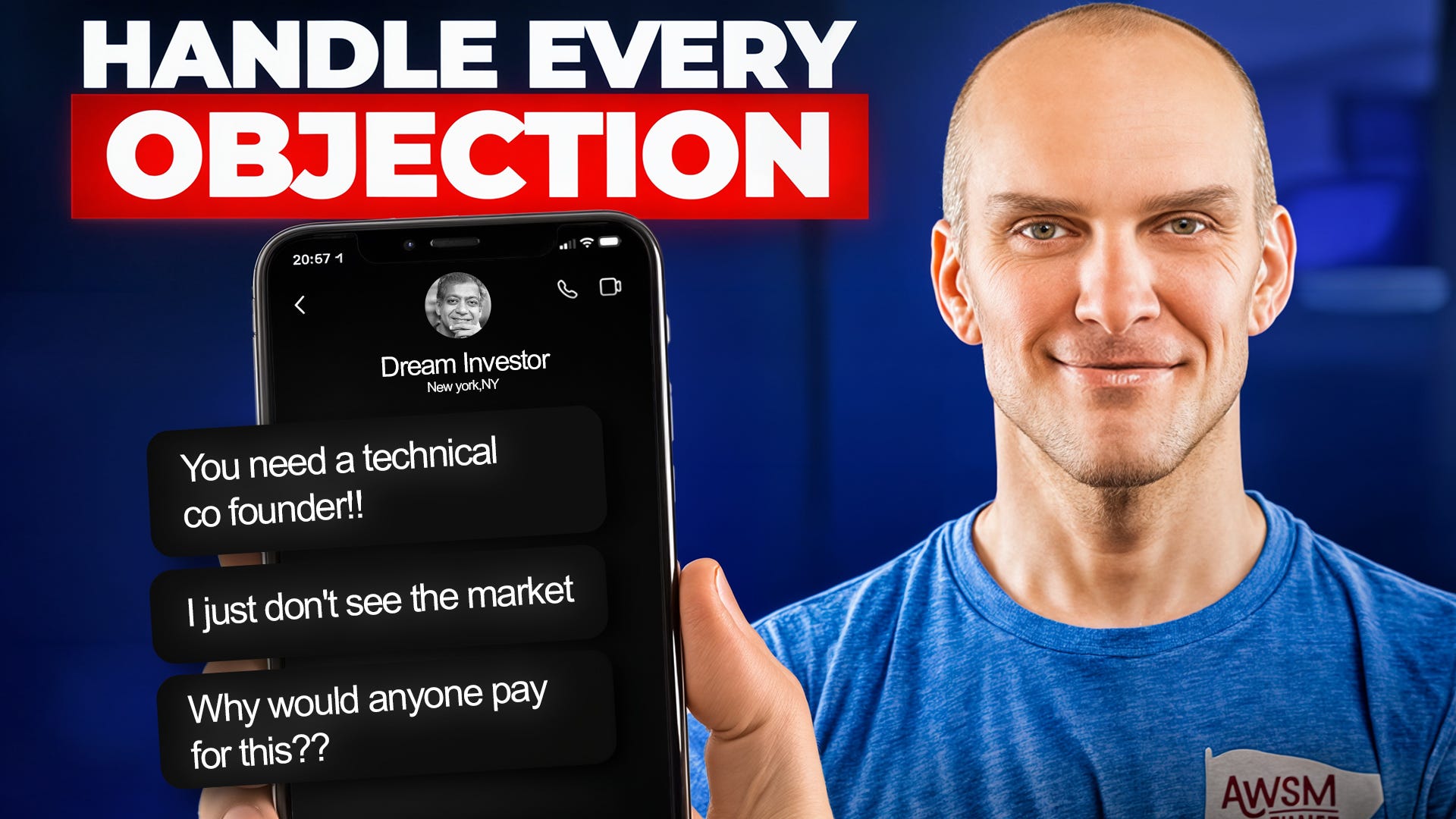
Visual Pain Point Representation: Shows actual rejection messages founders fear, creating immediate emotional resonance.
Pattern Interruption: A phone showing text messages creates visual interest and mimics a real-life scenario.
High Contrast Elements: A red highlight box on "OBJECTION" makes the issue stand out, signaling importance and danger.
Promise Clarity: "HANDLE EVERY OBJECTION" makes a bold, specific claim, appealing to founders' desire to be fully prepared.
Specificity: Shows real objections investors make, validating the viewer’s experiences and creating a “they get me” effect.
The contrast between the problem (rejection texts) and the solution (confident expert) creates a perfect tension-resolution loop that drives clicks.
Title Breakdown:
Now, the format of this title isn’t something I came up with - it's one that’s been working well and hasn’t really been adopted in this niche yet.
It might not work if you copy it verbatim.
It took me 5 hours to ideate-create thumbnail & to write this post, but I love doing this stuff.
PS: Want to Build & Scale your own personal brand that books 10-50 calls per month? Book a call - https://cal.com/abhinav-tiwari-weugnz/30min